卡塔玛雅香甜可口
这项研究是代表Katamaya. & savory进行的,旨在创造一种包装方式,从视觉和语言上都表明公司糖果和糖果的优良品质。
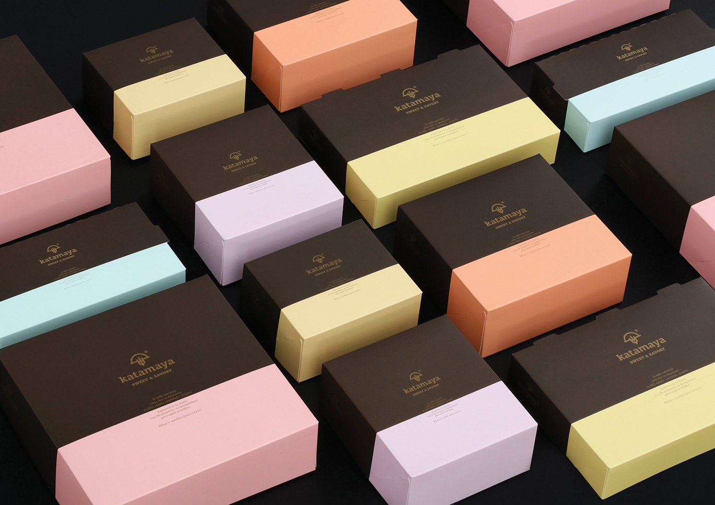
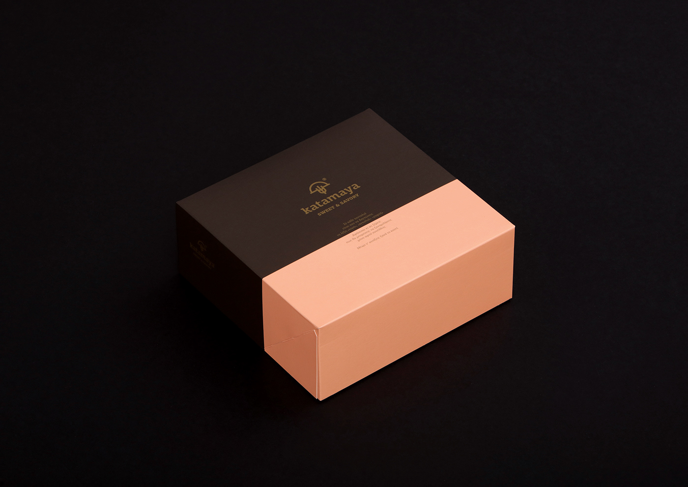
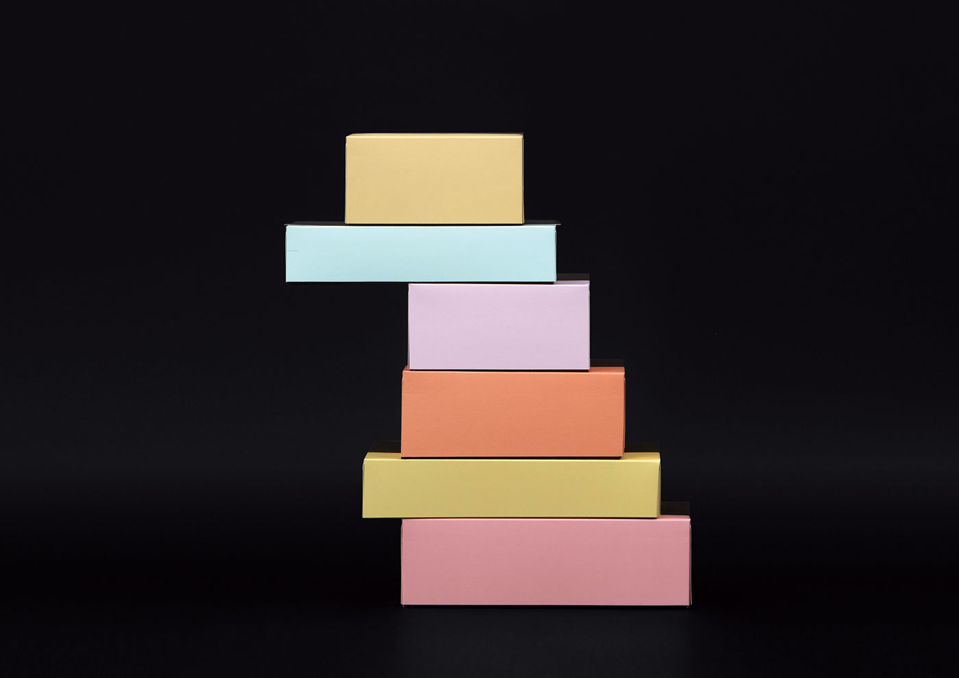
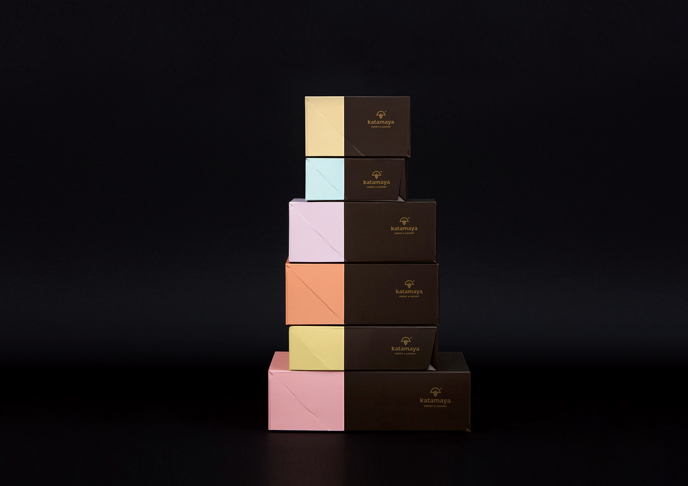
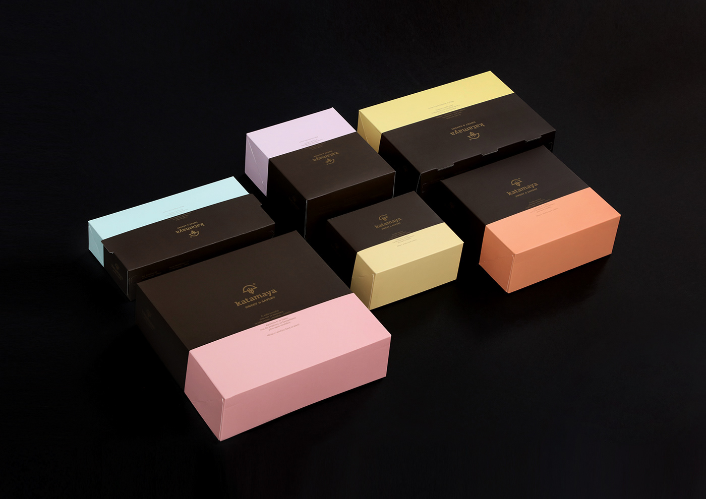
为包装选择的原色是深褐色,这是指巧克力。它与第二种颜色相结合,不同的包装,灵感来自糖果着色。
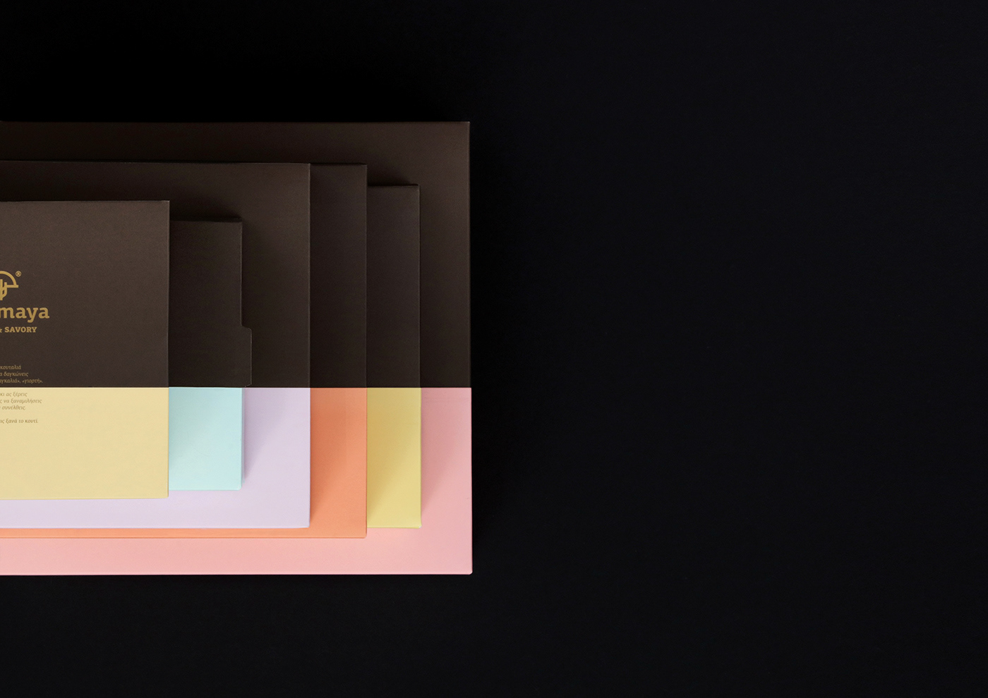
包装中的颜色比例是使用金色数字“φ”创建的,从而增强了和谐感和公司对细节和质量的重视。
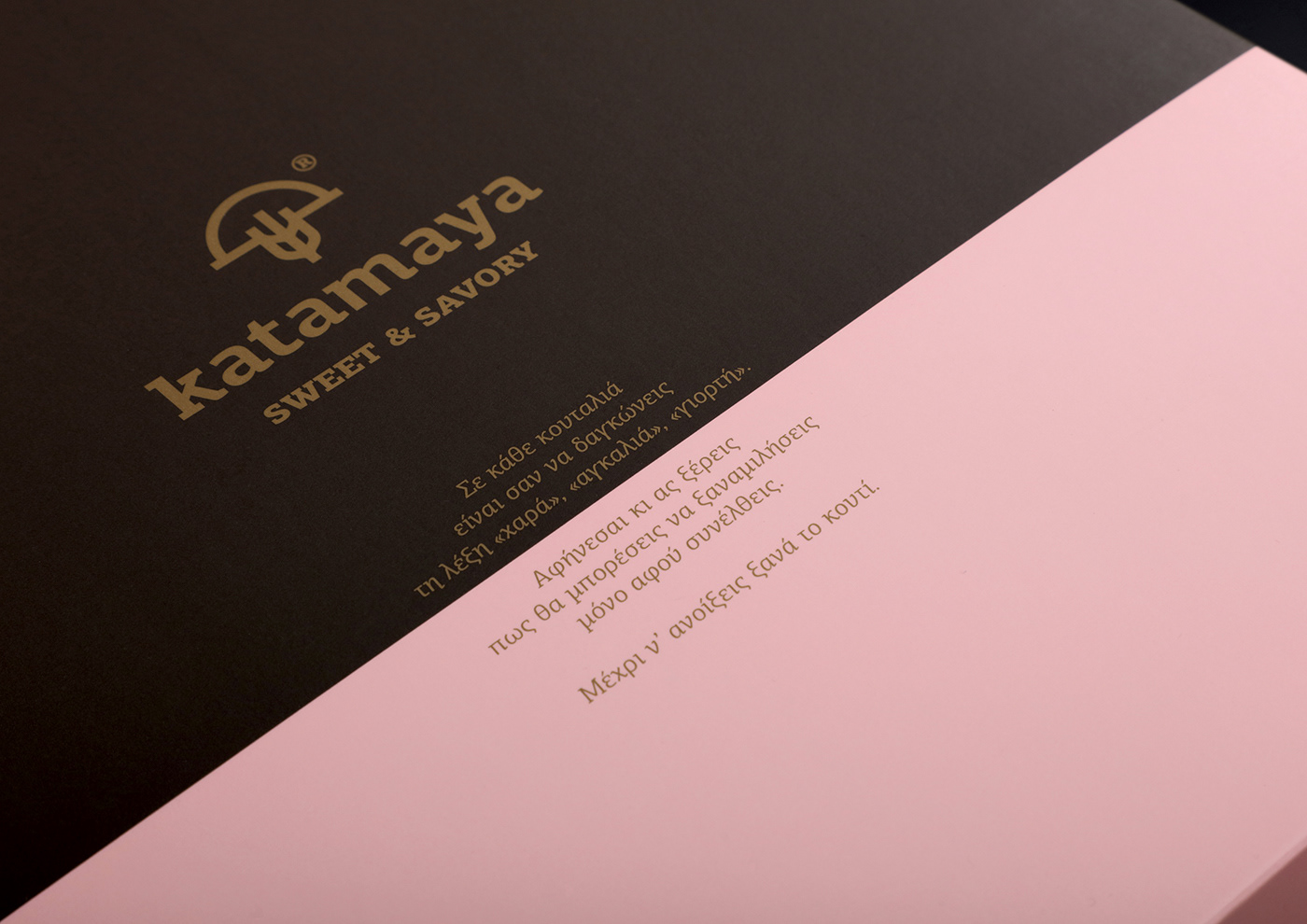
方框一侧的文本旨在积极地预设打开后将发生什么。
Katamaya | Sweet & Savory
The study conducted on behalf of Katamaya sweet & savory aimed at creating a packaging that would, visually and verbally, suggest the excellent quality of the company’s candy and sweets.
The primary colour selected for the packaging is the dark brown, which refers to chocolate. It was combined with a second color, different for each package, inspired by candy colouring.
The colour ratio in the packages was created with use of the gold number 'φ', thus enhancing the sense of harmony and the importance the company gives to detail and quality.
The text on the side of the boxes is intended to positively predispose in regards to what will follow their opening.

请搜索微信公众号:wwwtop0755com,或用微信扫描下面的二维码:

深圳市顶点企业形象策划有限公司 是一家企业VI设计与形象策划的综合服务提供商,我们坚持以创新的思路做品牌,做最有力的“创新型设计”!