芦荟包装_
复兴绿色
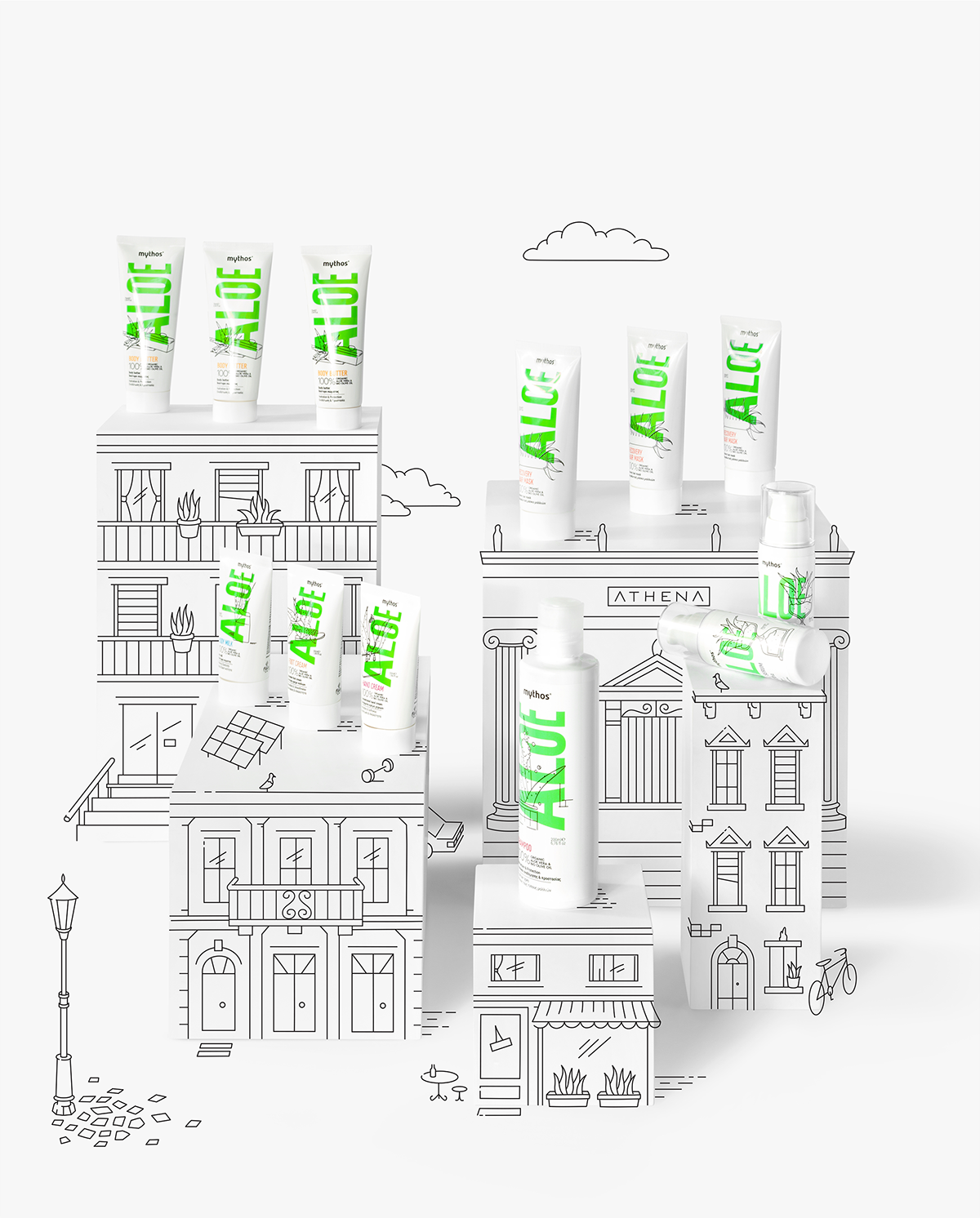
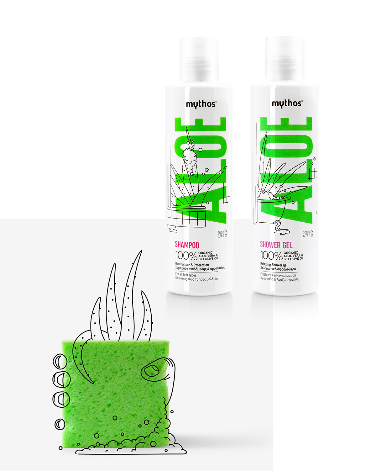
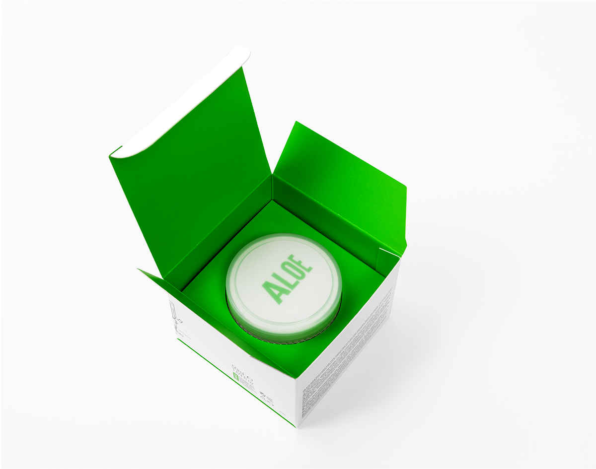
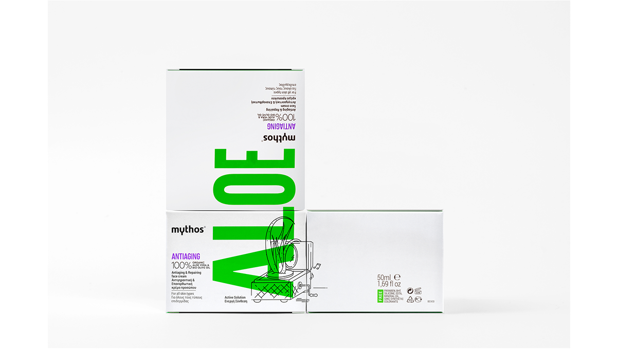
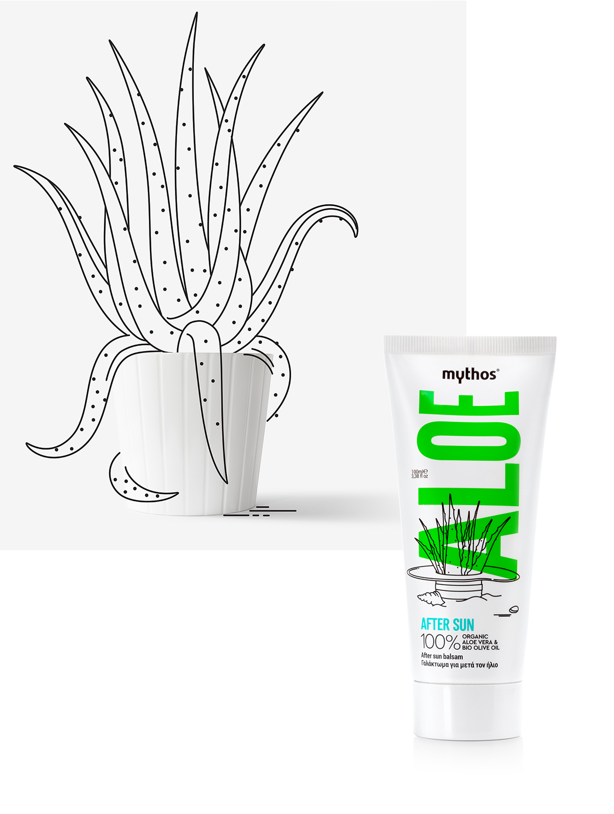
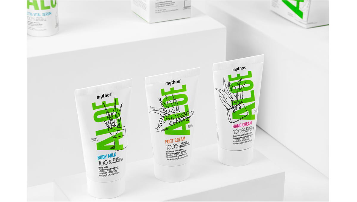
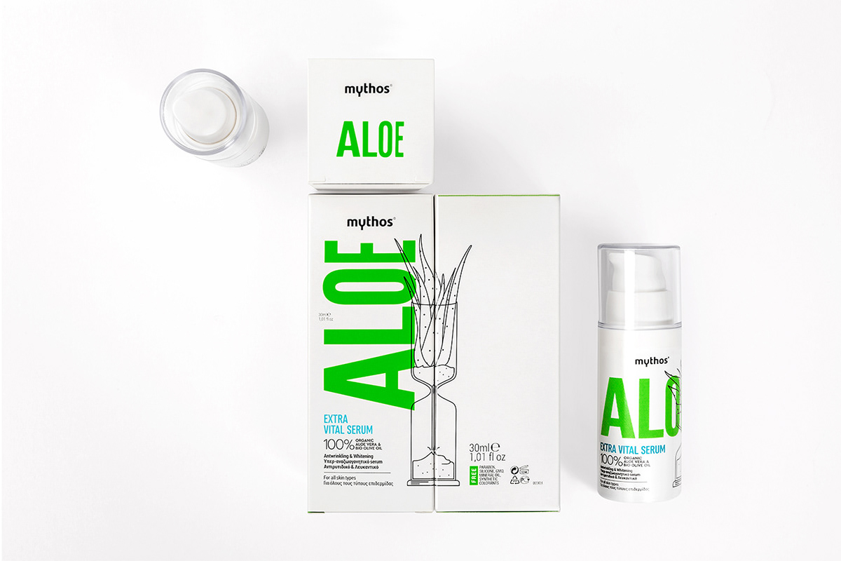
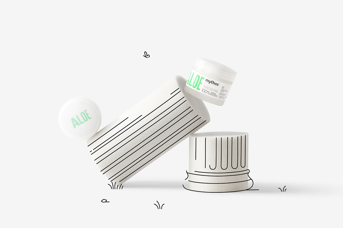
神话/芦荟是希腊旅游市场的一系列产品。客户简报指出,使用绿色加上单词芦荟,必须出现在包装上。由于其他比赛使用芦荟植物的摄影表现,我们选择采取不同的方法。在我们的设计中,一个决定性的作用是改变容器的小尺寸,这是由于实际原因对特定市场的需要。制定设计原则,我们选择突出绿色隔离白色容器,而排版的'ALOE'被设置的方式来定义稀少但垂直格式的容器。随着矛盾修饰法的产生,产品分类得到了加强,主题插图每次都讲述不同的故事,而芦荟植物起主导作用。所有必要的信息补充了艺术品,在容器前面,以干净和结构的方式。
Aloe packaging ©
Rejuvenating Green
Mythos / Aloe is a line of products for the greek tourist market. Client's brief indicated that the use of green color along with the word Aloe, had to be present on the pack. As the rest of the competition uses photographic representations of Aloe plant, we opted to take on a different approach. A decisive role in our design was the varying of the containers small sizes, as a necessity to the specific market for practical reasons. Laying out the design principles we chose to highlight the green color isolating it on white containers, while the typography for ‘ALOE’ was set in a way to define the scarce but vertical format of the containers. Product categorisation was enhanced with the creation of oxymoron, thematic illustrations that tell a different story each time, while the Aloe Vera plant takes a leading role. All the necessary info complements the artwork, on the front of the container, in a clean and structural way.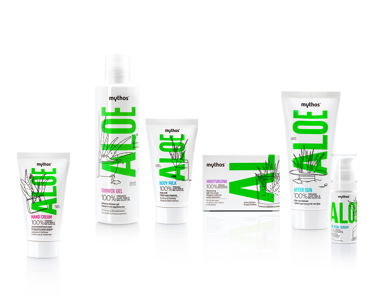
请搜索微信公众号:wwwtop0755com,或用微信扫描下面的二维码:

深圳市顶点企业形象策划有限公司 是一家企业VI设计与形象策划的综合服务提供商,我们坚持以创新的思路做品牌,做最有力的“创新型设计”!