杜邦公司百年来首次新标志变革
杜邦公司百年来首次新标志变革
美国杜邦公司是一家以科研为基础的全球性企业,一直在通过创新改变科学和化学领域。
DuPont Co's first landmark change in the past hundred years
DuPont is a global research-based company that has been transforming science and chemistry through innovation.
品牌简介
美国杜邦公司是一家以科研为基础的全球性企业,一直在通过创新改变科学和化学领域。在70多个国家经营业务,历史悠久,与中国的生意往来可追溯到清朝,近日公布了新标志作为品牌变革的一部分。
设计公司
Lippincott
战略思考
新的现代化标志预示着杜邦作为公司和全球品牌的转型。新品牌形象将重点放在以客户为导向的创新战略和目标驱动型文化上,是杜邦在转型中采取的众多措施之一,帮助客户解决复杂问题,并将最好的想法转化为现实世界的产品和解决方案。
设计阐述
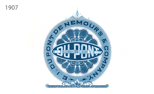
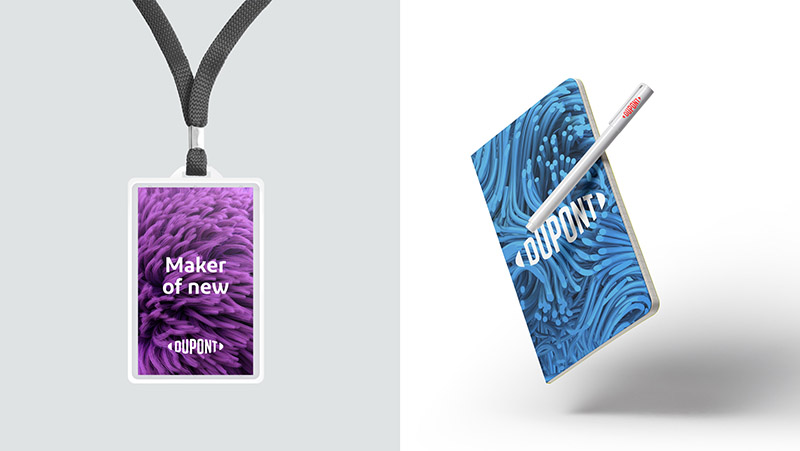
新标志保留了标志性杜邦椭圆形的传统,一个多世纪以来,它的质量,性能和信任已经深深烙印在品牌之上,没有了椭圆边界的限制,标志着新杜邦开放的思想和革新。
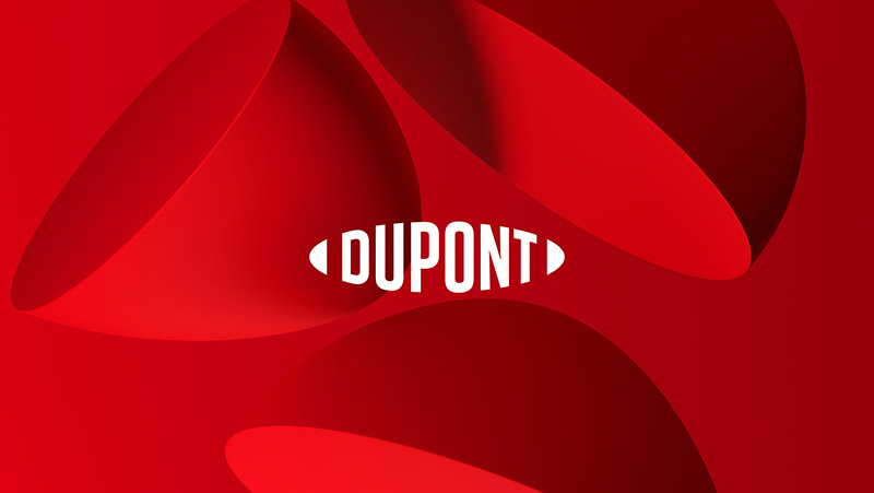
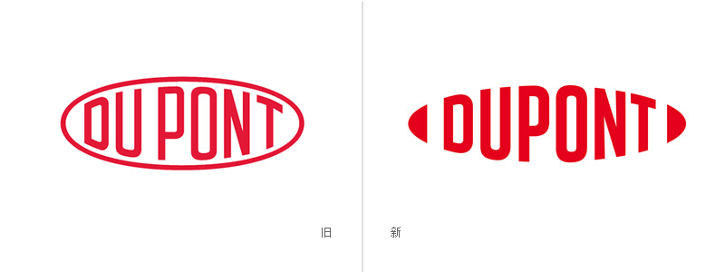
旧的标志“Du”和“Pont”之间的空间被放弃了。设计团队还研究了包括符号和颜色在内的概念,更加印刷细化,重绘的字形重量感更强,以加强现有商标的功能性。
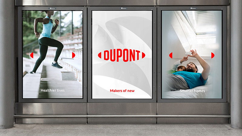
标志开头和结尾处的两个小块在数字媒体应用中可以发挥特别的作用。一是将它们转换成3D形状,看起来前卫和抽象,使得这样的巨头企业更酷。另一种方法是用作广告中,它可以立刻被识别。设计表现出大胆,现代的姿态。
该标志并没有研发品牌字体,而是使用现成的字体,在最近的案例中,尤其是对于一个拥有相当规模的公司来说,这倒是比较少见,包装和标志将在新公司成立后逐步改变。
Brand introduction
DuPont is a global research-based company that has been transforming science and chemistry through innovation. Business with China dates back to the Qing Dynasty and has a long history operating in more than 70 countries. New logos have recently been unveiled as part of a brand change.
design company
Lippincott
Strategic thinking
The new symbol of modernization foreshadowed the transformation of DuPont as a company and global brand. The new brand image, which focuses on customer-oriented innovation strategies and goal-driven culture, is one of the many initiatives DuPont has taken in its transformation to help customers solve complex problems and translate the best ideas into real-world products and solutions.
Design elaboration
The new logo retains the iconic DuPont oval tradition. For more than a century, its quality, performance and trust have been deeply imprinted on the brand, without the limitations of the elliptical boundary, marking the new DuPont open thinking and innovation.
The space between the old logo "Du" and "Pont" has been abandoned. The design team also studied concepts including symbols and colours to enhance the functionality of existing trademarks by making printing more detailed and redrawing the glyph more weight-sensitive.
The two blocks at the beginning and end of the logo play a special role in digital media applications. One is to transform them into 3D shapes, which look like avant-garde and abstract. Another way is to be used in advertisements, which can be identified instantly. The design shows a bold and modern attitude.
Instead of developing brand fonts, the logo uses off-the-shelf fonts, which are rare in recent cases, especially for a company of considerable size, where packaging and logos will gradually change after the new company is established.
欢迎收听“深圳市顶点企业形象策划有限公司”官方微信:
请搜索微信公众号:wwwtop0755com,或用微信扫描下面的二维码:
深圳市顶点企业形象策划有限公司
是一家企业VI设计与形象策划的综合服务提供商,我们坚持以创新的思路做品牌,做最有力的“创新型设计”!